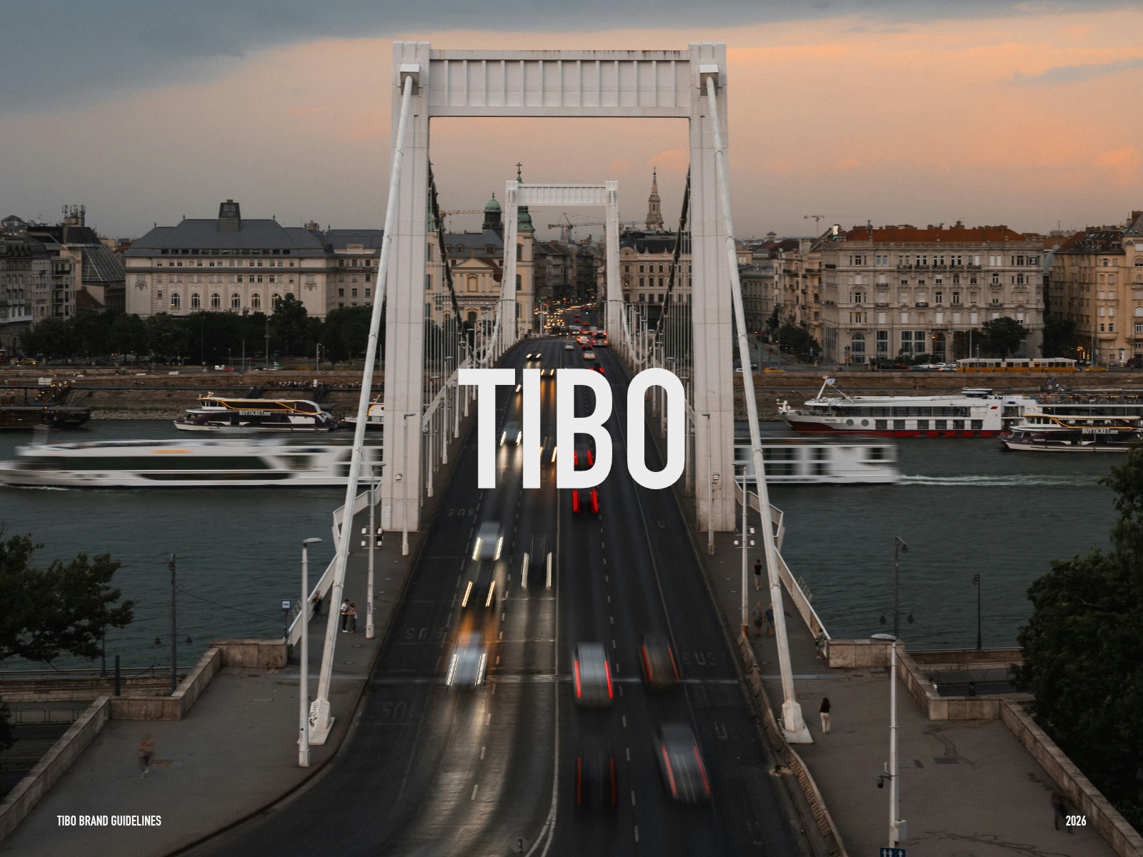
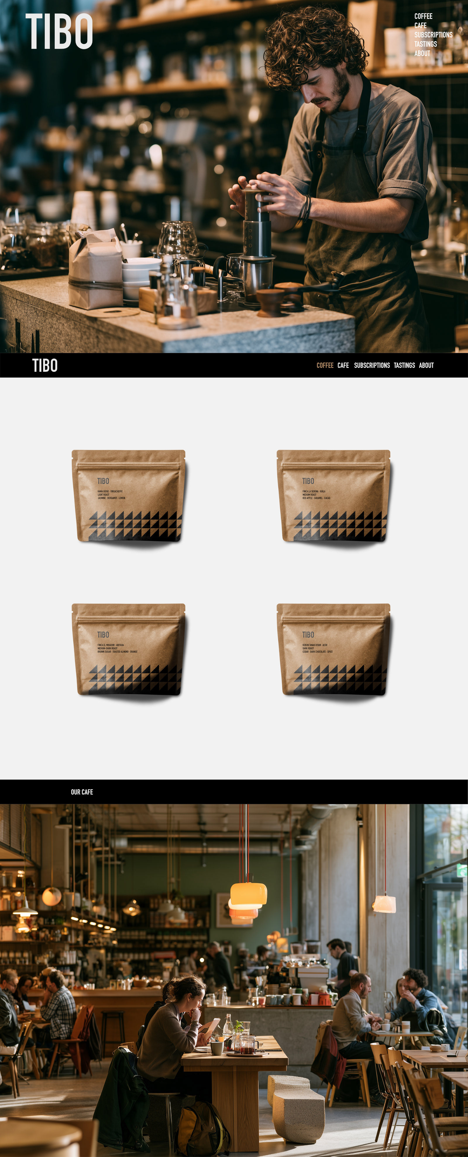
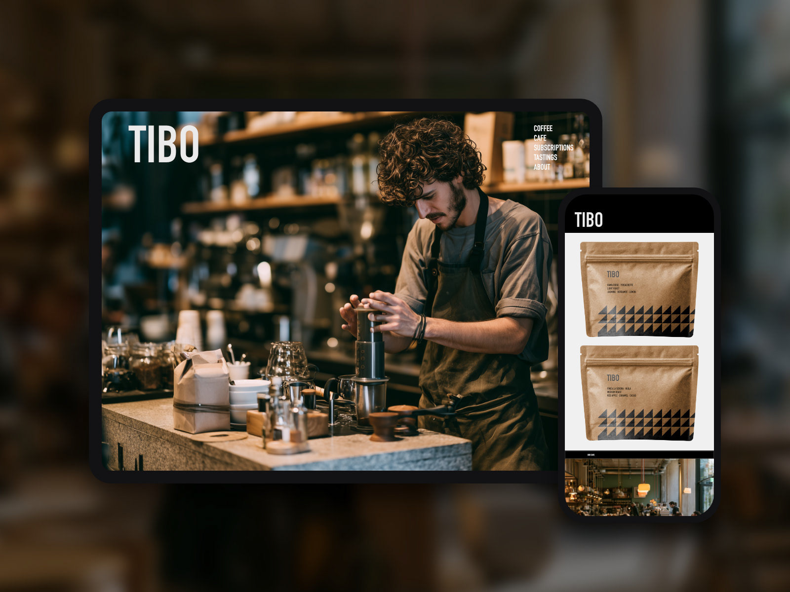

TIBO is a self-initiated brand concept developed to explore identity and packaging for the specialty coffee sector.
TIBO is imagined as a boutique coffee shop and roastery built around slow mornings, single-origin craft and mindful design.
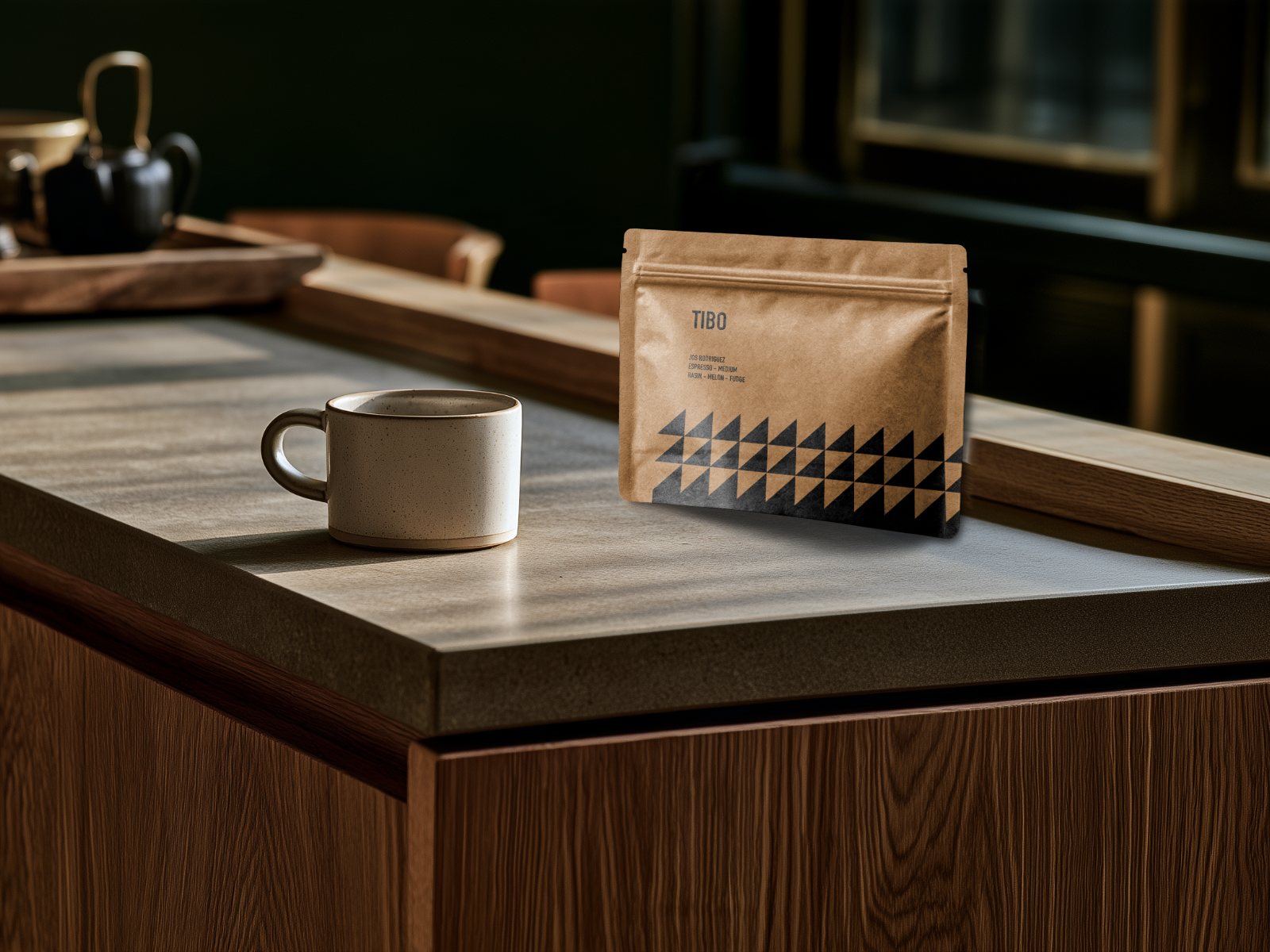
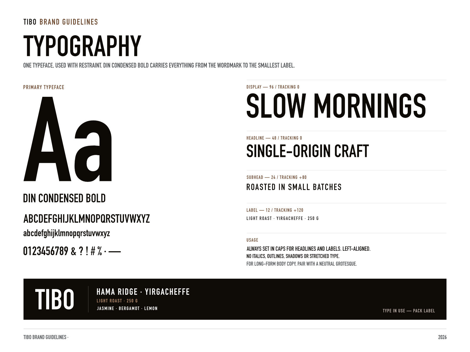
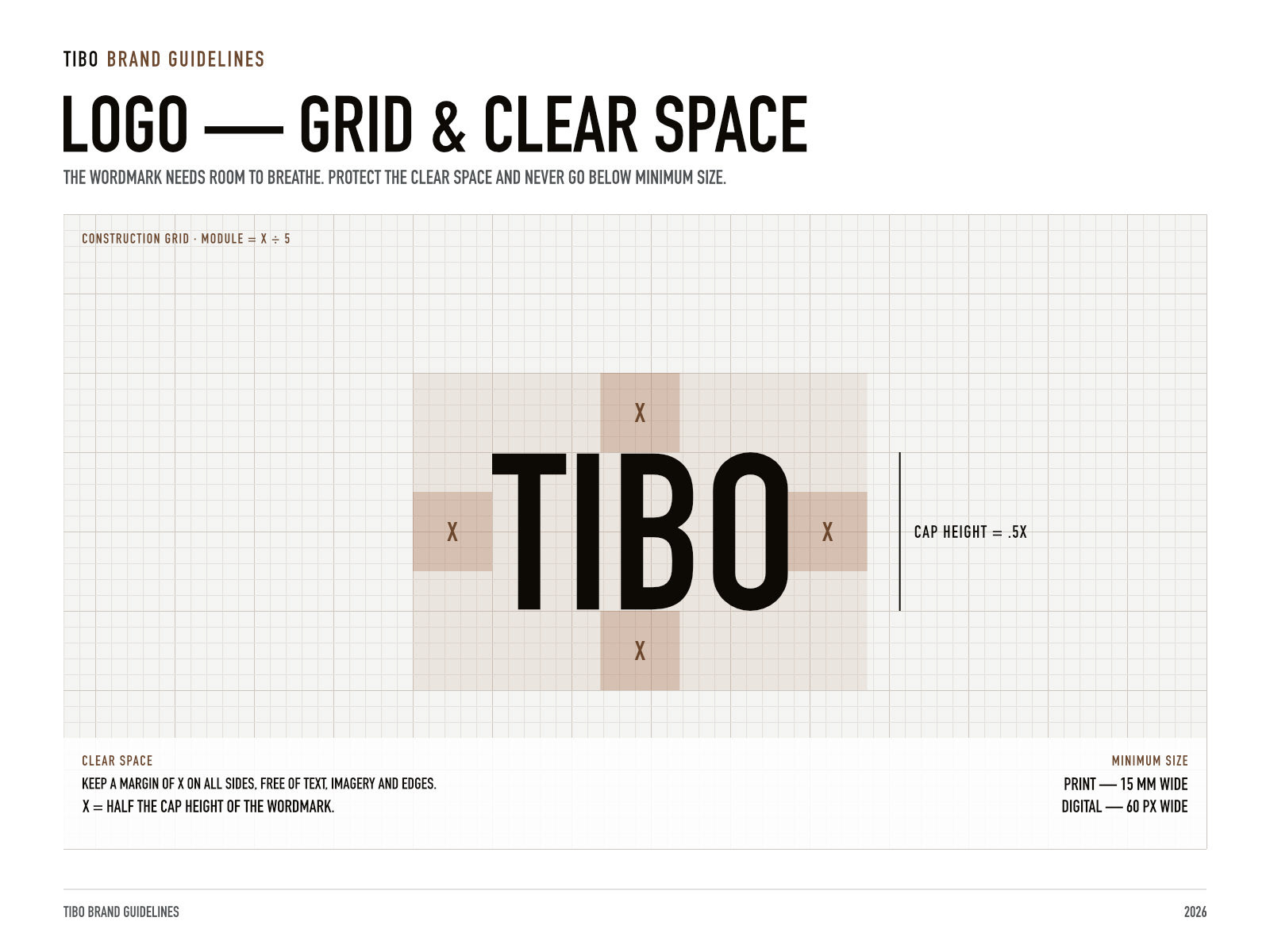
The identity is deliberately restrained. A condensed, all-caps wordmark sits quietly at the top of each bag, so the product speaks before the brand does. The main graphic is a triangle-grid pattern that gets denser and darker toward the base of the pack, a nod to beans settling and to the gradual depth of a slow roast.
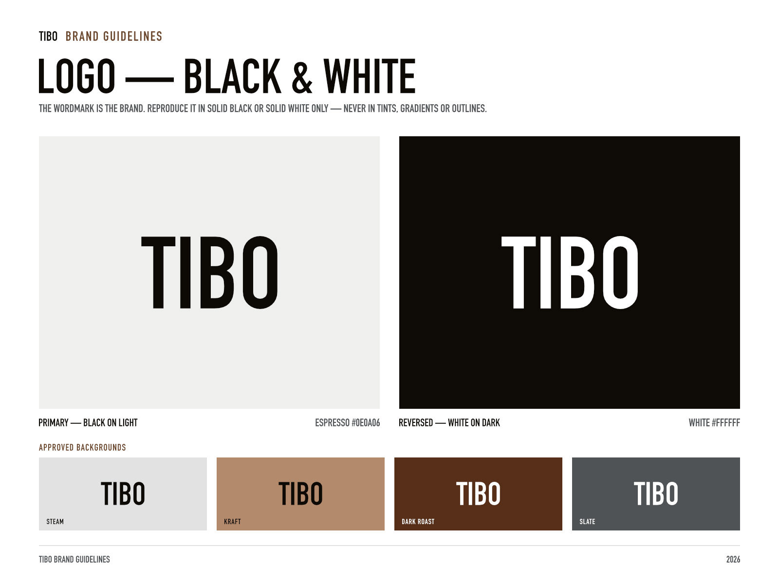
Natural kraft stock and a warm palette, running from espresso black through roasted browns to soft stone greys, keep the system grounded and tactile. The pattern can shift in colour and density across origins while the brand stays unmistakably TIBO, from retail bags to storefront signage.
Brand identity · Packaging - UI
Interested in something similar for your café or roastery? Get in touch.itself.