
GREEN LEAF
Combining cutting-edge engineering precision with the raw potential of natural resources, the Greenleaf concept generates active, high-yield green energy across solar, wind, hydro, geothermal, and bioenergy networks. The company is subverting traditional utility models with intelligent, low-impact solutions engineered for continuous, resilient, and zero-carbon power generation.
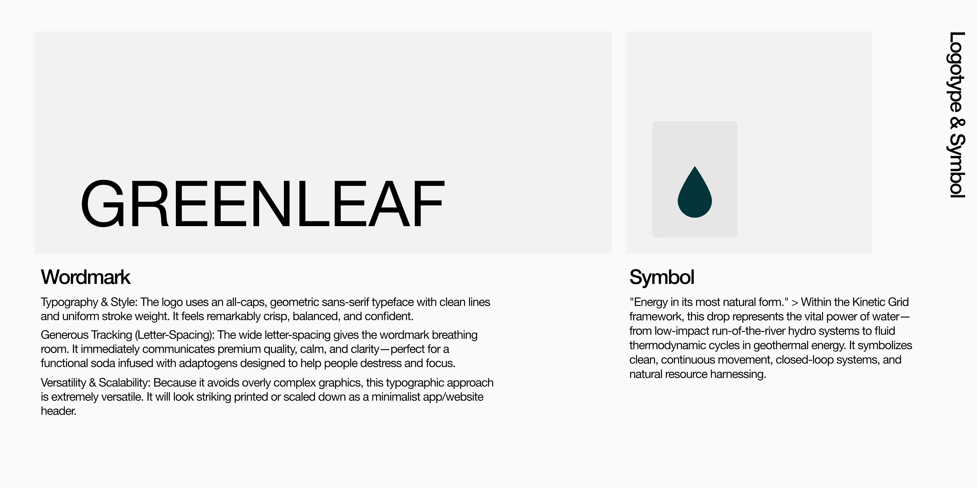
The accompanying wordmark employs an all-caps, sans-serif typeface with clean lines and a uniform stroke weight, delivering a remarkably crisp, balanced, and confident aesthetic. Its generous letter-spacing gives the typography ample breathing room, communicating premium quality, calm, and clarity while maintaining minimalist versatility across print and digital platforms. Complementing the wordmark, the teardrop symbol represents energy in its most natural form within the kinetic grid framework. It highlights the vital power of water—from low-impact run-of-the-river hydro systems to fluid thermodynamic cycles in geothermal energy—embodying clean, continuous movement, closed-loop systems, and natural resource harnessing.
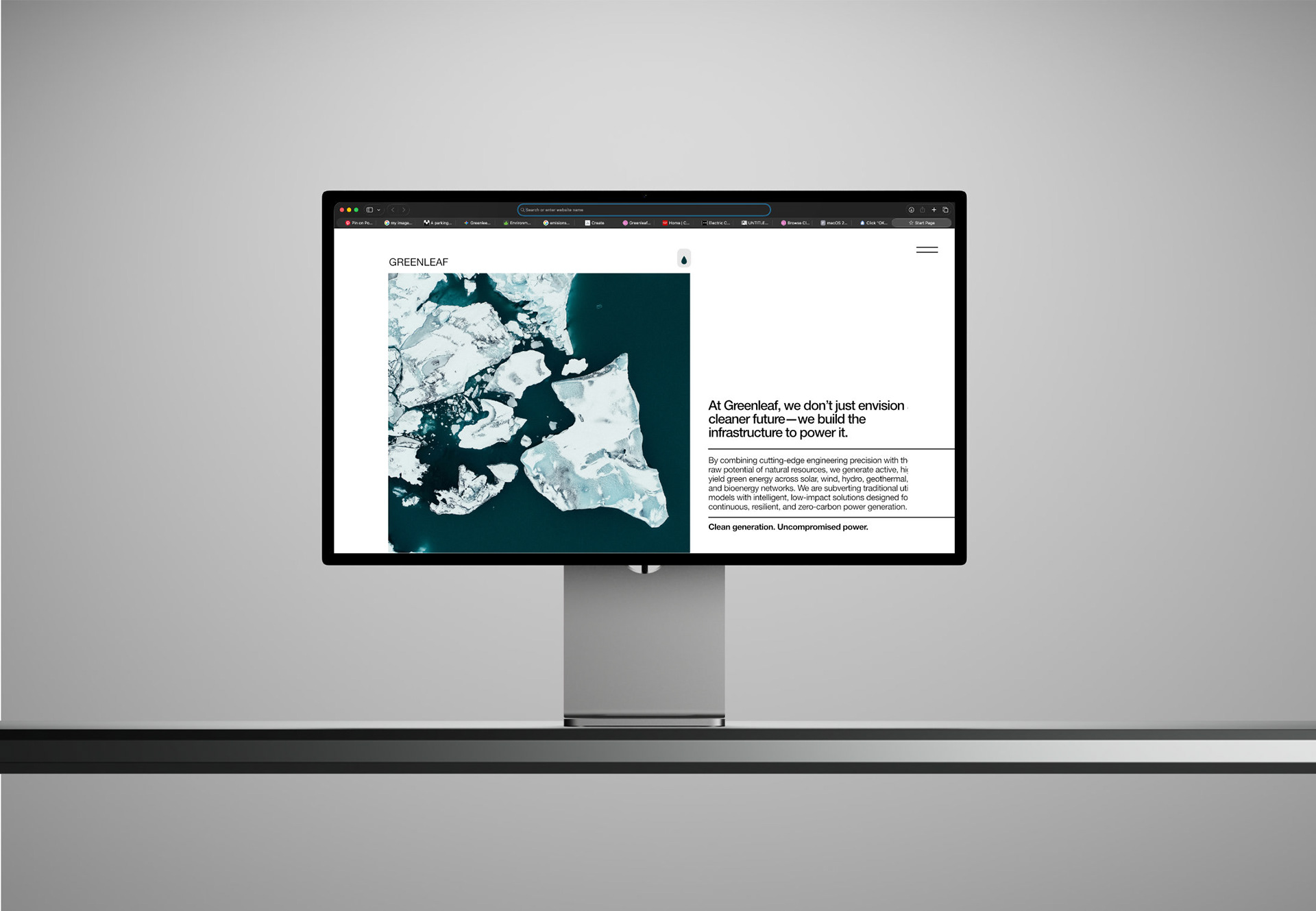
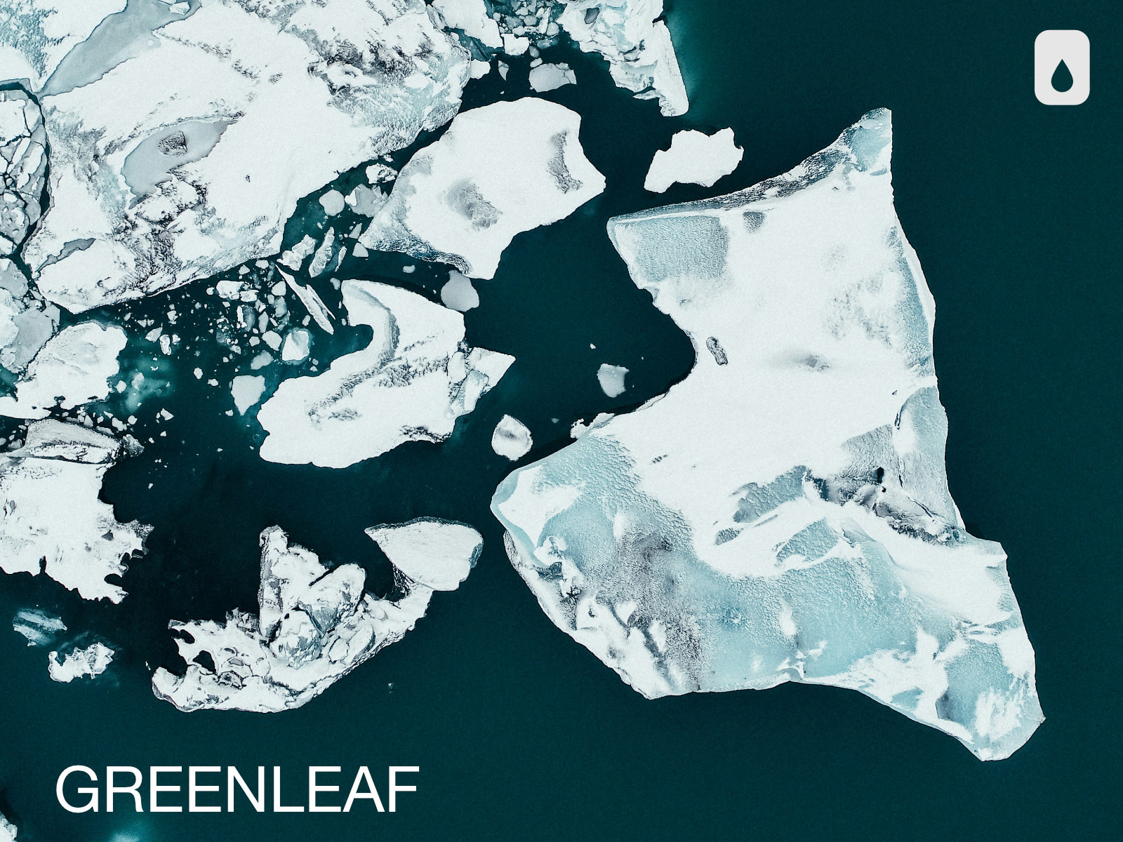
The digital mockups present expansive outdoor environments to highlight the pristine beauty of nature. By combining evocative landscape imagery with clean layouts, the visual system demonstrates the vast scale of Greenleaf’s projects while emphasizing its commitment to minimal ecological disruption and responsible resource management.